
hi, I'm Paula
I hyperfixate on new things easily. I used to see that as starting too many things, but I've come to embrace the fact, that I love learning new things and am able to do so quickly.
I love puzzles. Give me something complex and I’ll break it down to its simplest form and find a way through. Patterns show up everywhere I look, and I can’t help making sense of them. If something isn’t working and nobody knows why, give me a few moments and I’ll probably have five solutions.
Two things keep me sane: my dog and my notebook. Walks give my brain room to breathe, and writing by hand makes ideas stick, whether it’s something important or what I want to do next.
my cv


What you will find me doing:

Yves & Co
the project
For Yves & Co, a newly founded network of interdisciplinary specialists, I designed the complete website and visual identity (excluding the logo).
The goal was a bold digital presence that stands out visually and still makes complex content easy to navigate. Expressive visuals sit on top of a clear hierarchy. Interaction design and scrollytelling guide users through the content, and every motion, transition and layout shift has a job: orientation, rhythm and flow instead of decoration.
what i liked about it
We had a lot of creative freedom on this project, and the result is loud and very colorful. The color is functional, though. The site is structured in layers, and each layer has its own color, so a large amount of content fits onto what is essentially a single page without losing clarity. That is what I enjoyed most: using the freedom to build a system that is confident in attitude and precise in structure, and that reflects the network’s interdisciplinary mindset.
2024
Who's Mark

Balls in Concert
the project
Balls in Concert is a public awareness campaign by The Robin Cancer Trust, the UK’s testicular, ovarian and germ-cell cancer charity, created to break the taboo around testicular cancer. Its centerpiece is a MIDI controller shaped like a scrotum, played in the music video for the song “Check Your Balls”. I designed the campaign website and oversaw its development. The challenge was to give it the same vibe as the campaign in very little time. I worked from the campaign package and adapted many of its elements into interactions, so the site feels like the campaign: playful, a little absurd and clear about its message.
what i liked about it
I had a lot of creative freedom here, and I used it to keep the site light and fun. What I enjoyed most was that the project had real meaning. A topic that people rarely talk about got an entry point that makes them smile first. It was also a great project from a craft perspective: a tight timeline, a strong visual starting point and room to turn it into something interactive.
2024
David und Martin
since David + Martin has closed, some links may no longer work or may look different.
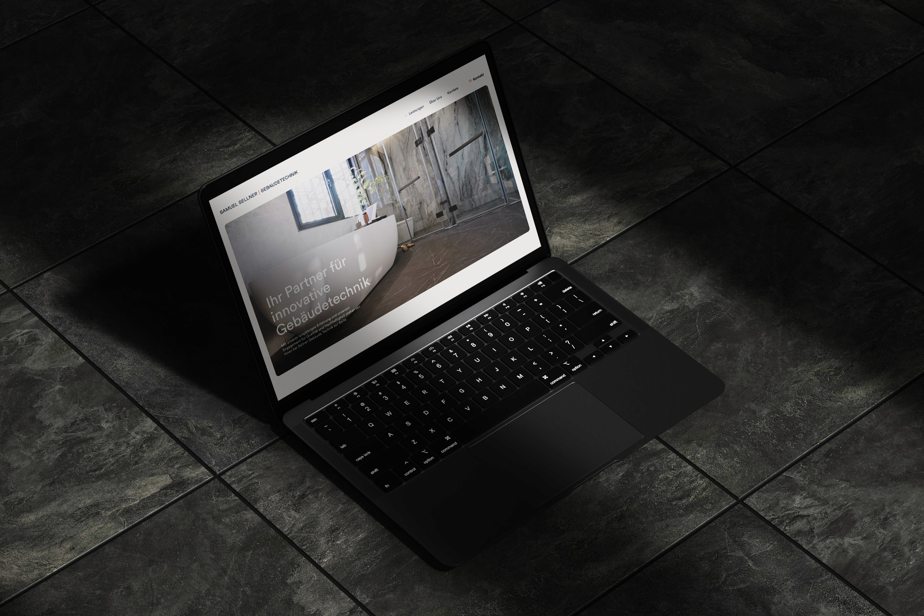
Samuel Sellner
the project
Samuel Sellner Gebäudetechnik is a team of specialists from different trades, covering bathrooms, heating, ventilation and technical planning. I designed their website and oversaw its development, with the goal of translating that craftsmanship and technical expertise into a clear, trustworthy digital experience. It stays modern and approachable, so a complex range of services is easy to grasp at first glance.
what i liked about it
The design is high quality and deliberately calm. Generous white space gives the services room to speak for themselves, and small micro-animations structure the content and keep it interesting without getting in the way. The result is a site that feels as reliable as the work behind it. What made this project special was the client’s trust. They gave us a lot of confidence, and that let us build something we are proud of.
2024
Who's Mark
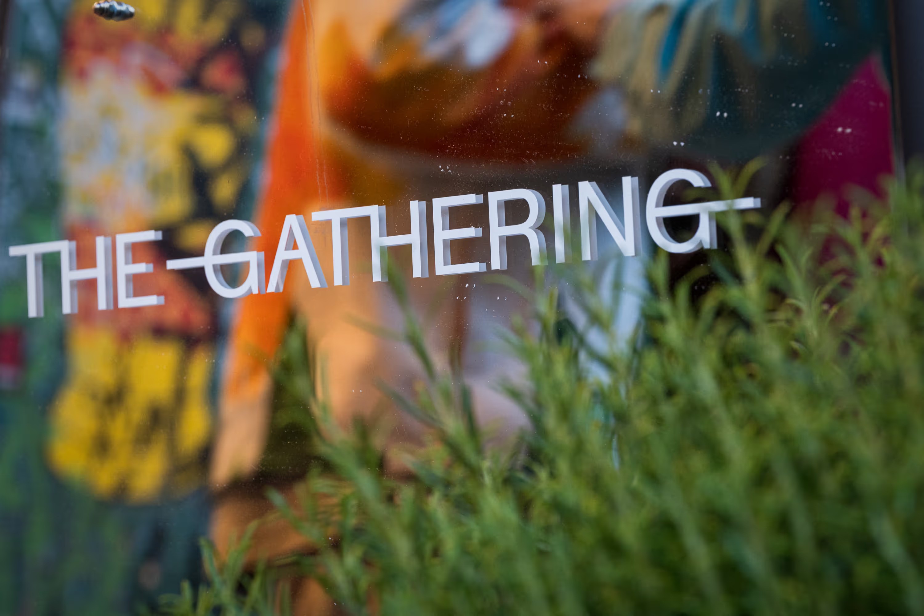
The Gathering
the project
THE GATHERING is an event format built around layers: intellectual, emotional and spatial. We took an existing event series and built a coherent concept behind it, so that every element adds depth and serves the idea. Each event series got its own branding with its own colors. I was part of the branding team, designed the website largely on my own and accompanied the project through its development.
On the website, the layers come to life through scrolling. The site is not a promotional surface but an extension of the concept: reduced, rhythmic and structured, like the format itself. No stages, no pitches, no performative networking, just the right people, the right setting and a shared curiosity.
what i liked about it
What I liked most was how holistic the project was. We could start from scratch, look closely at every detail and bring the concept into all of them, from the brand to the flow of the website.
2025
David und Martin
since David + Martin has closed, some links may no longer work or may look different.
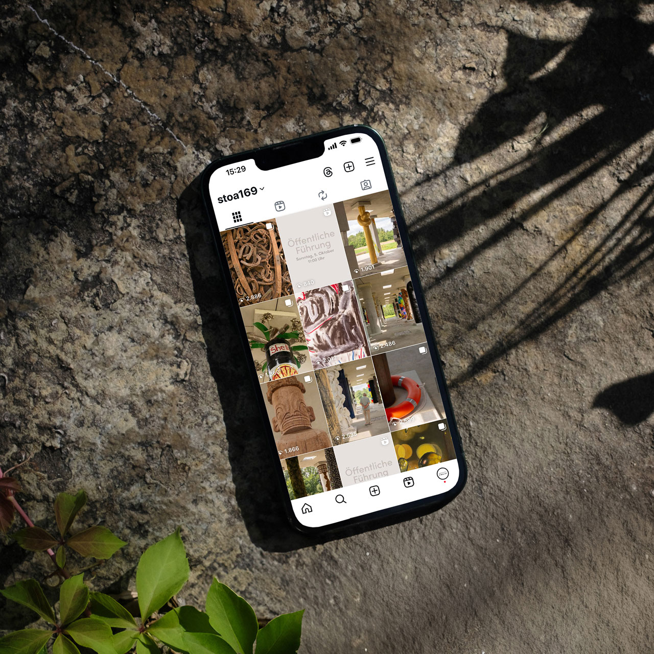
STOA169
the project
STOA169 is an open-air column hall and cultural foundation in Bavaria. I photographed the architecture and the artworks on site, with a focus on atmosphere, light, landscape and the changing seasons. I edited the images into one consistent visual language and used it to restructure the Instagram feed.
The challenge was to translate the physical experience of the place into a digital format: the scale of the architecture on one side, the details of individual works on the other. Careful sequencing and feed planning give the content rhythm and continuity, and each artwork still gets its own space. The result is a calm, curated presence that fits the contemplative character of STOA169.
what i liked about it
The project covered everything I enjoy: shooting on location, developing a visual language and planning the feed as a whole. The place is stunning, and so is what its founder is building there. Being able to support that with my work made it a project I was glad to be part of.
2024
Who's Mark

Wenn die Lebkuchen rufen!
the project
“Lebkuchen” is a short film about a chance encounter on Christmas Eve at a remote rest stop, where a Christmas skeptic meets a mysterious stranger. It is a quiet, intimate story about connection, vulnerability and unexpected warmth.
I was responsible for the art direction and large parts of the production. I shaped the film’s visual identity from concept to final frame: the on-screen graphics, the look of the sets and the end credits. I worked closely with camera and lighting to keep the aesthetic cohesive, and I supervised set design, props, costumes and makeup. The visual language is built on restrained details, mood and emotional clarity rather than spectacle.
what i liked about it
What I enjoyed most was shaping the entire visual world from the first idea to the last frame, with every detail pulling in the same direction. Working on set with the team made it even better. That is where the concept turned into something real.
2023
STOA169


Diversity in Architecture
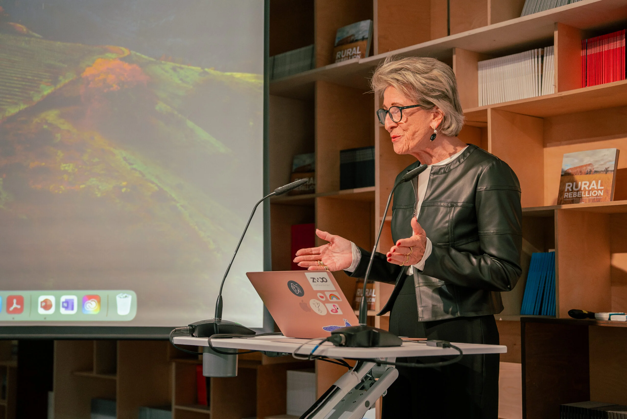
Stadtsparkasse




Master Thesis
the project
In creative agencies, the most important resource is human creativity, yet who works on which project is rarely decided systematically. My master’s thesis explores how staff allocation in creative agencies can be improved, using the Munich agency David + Martin as a case study.
I started from socio-technical systems theory and the research on creative work, project-based organizations and internal talent markets. I then tested my assumptions in the agency itself, with a survey of 54 employees and interviews across creative, consulting, strategy and management. From the analysis I derived a catalogue of requirements and turned it into a concrete concept: briefing structures by project type, skill profiles and an AI assistant built on Langdock, with people staying in the loop.
what i liked about it
What I enjoyed most was the full arc of the work: talking to everyone, finding the underlying problems and building something concrete in response. The agency was my own working environment, so every conversation fed directly into the solution.
2026
David und Martin